Journey Students
SERVICES
Brand Strategy & Design
Environmental Design
Custom Fixtures & Signage
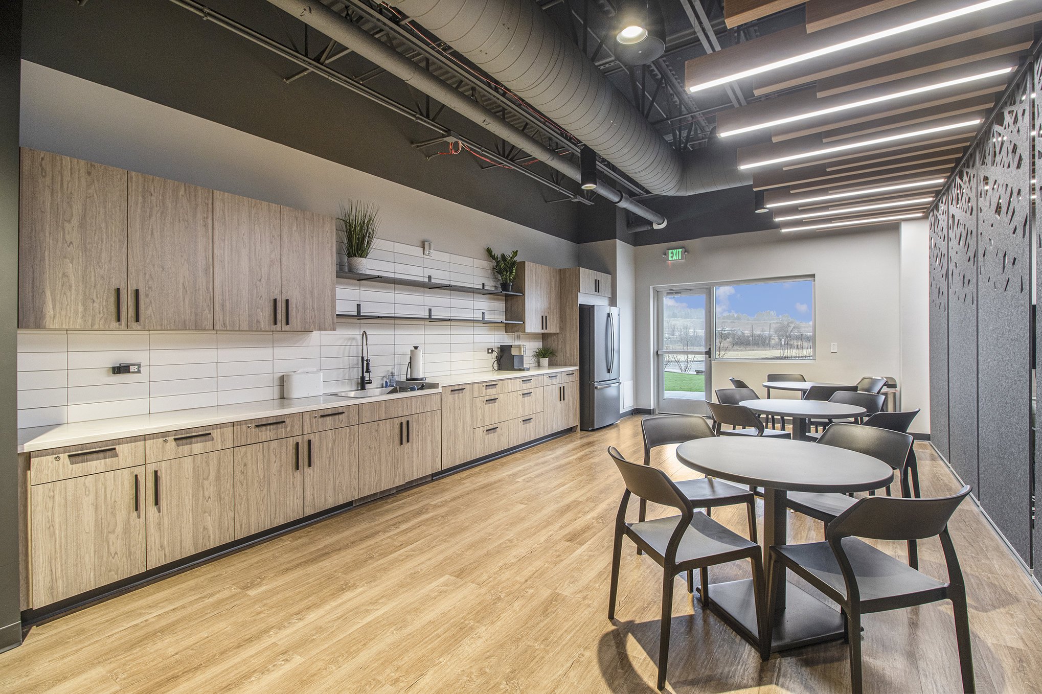
The final space we designed for Journey Church was the student room. We wanted to maximize the functionality of this large rectangular room to support student gatherings as well as work and meeting space for staff during the week.
The wood-look baffles and large acoustic wall panels help define different zones throughout the room like the stage, kitchen, gaming area and built-in cafe seating. And because of the ample natural light this room receives, we were able to lean into a dark, moody palette that feels mature and edgy.


We kept the majority of the room design neutral, but had fun injecting a youthful personality in the gaming area with colorful patterned rugs and green faux-leather chairs.
To maintain flexibility and functionality, the TV’s and gaming consoles can be stored out of sight, and the furniture can be rearranged into a lounge-style seating area.
Finally, hanging acoustic panels and overhead illuminated baffles help to define this space and separate it from the kitchen on the other side.


This room offered one long uninterrupted wall so we designed a subtle, yet bold graphic treatment created using low-contrast painted letters and a high-gloss vinyl wall pattern. The missional phrase is high-impact without overpowering the room as a whole. In addition, we nestled a 19 foot custom banquette between the existing support columns and had more wood-look acoustic baffles and pendant lights installed overhead.


The entrance to the student room is located in the elementary hallway of the kids area. The client requested a map that identifies all the elementary, middle and high schools represented by their church.
We designed this slightly abstracted area map with custom painted acrylic numbers, a vinyl color key and a coordinating list of school names so that kids of all ages could take pride in finding their school on the wall.
To see our work on the Journey Kids space, click here.


In addition to designing their space, the student team asked if we could create a logo suite for their middle school and high school student groups to be used for merch, marketing collateral and other branded elements. We created a series of badge-style logos that still compliment the greater Journey Church brand and differentiated the two groups using color - blues and whites for middle school, and black and white for high school.

