One Hope Kids
SERVICES
Brand Strategy & Design
Environmental Design
Custom Fixtures & Signage
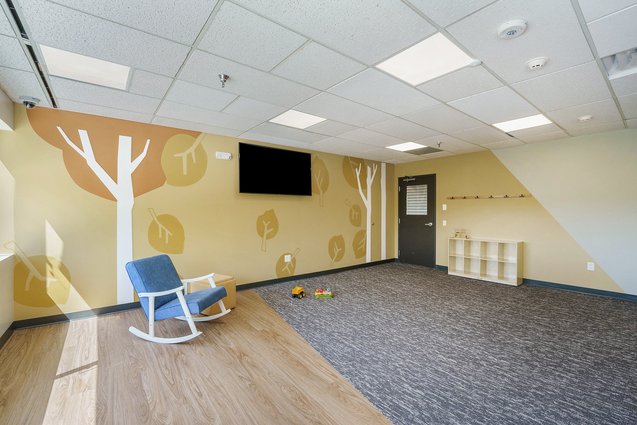
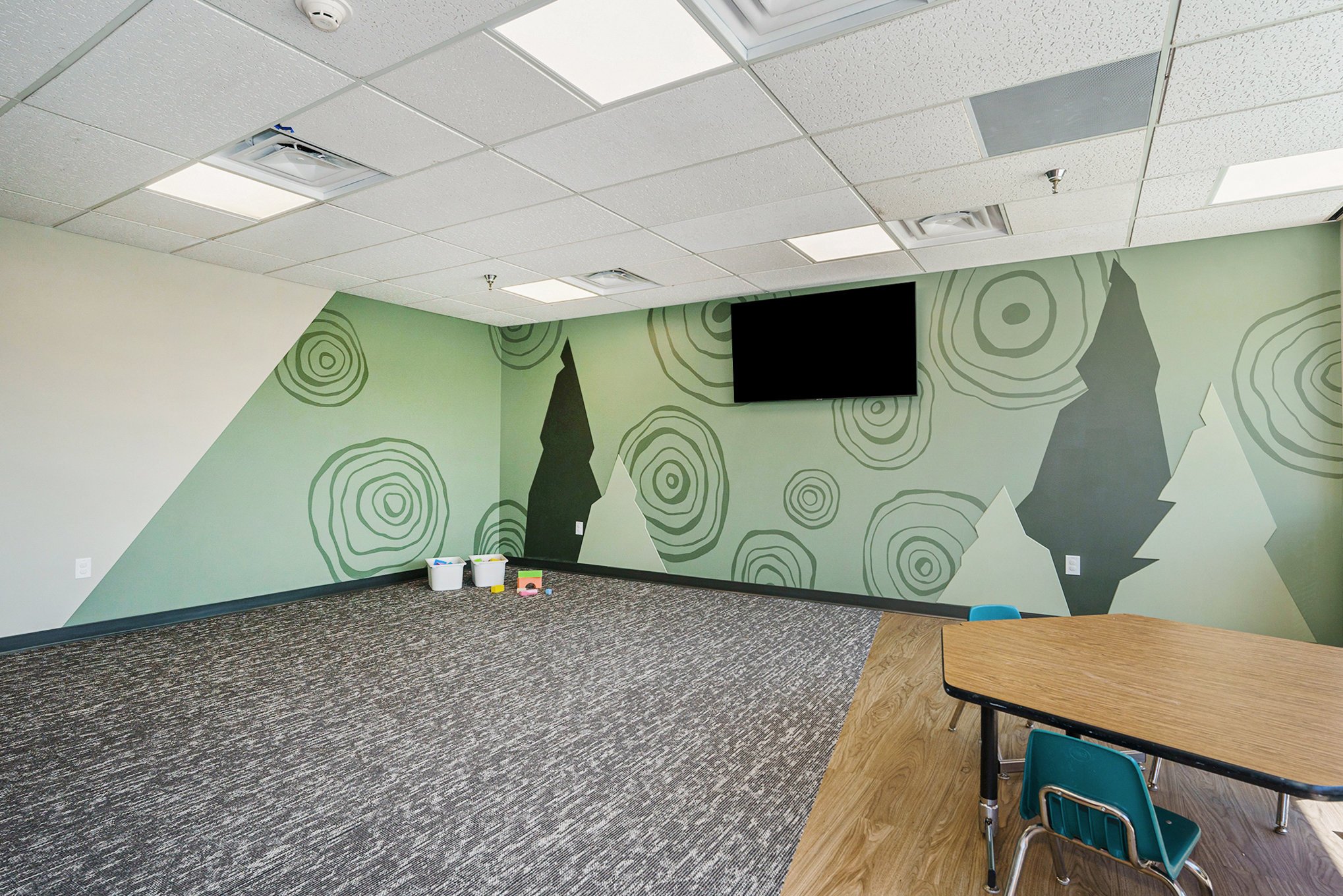
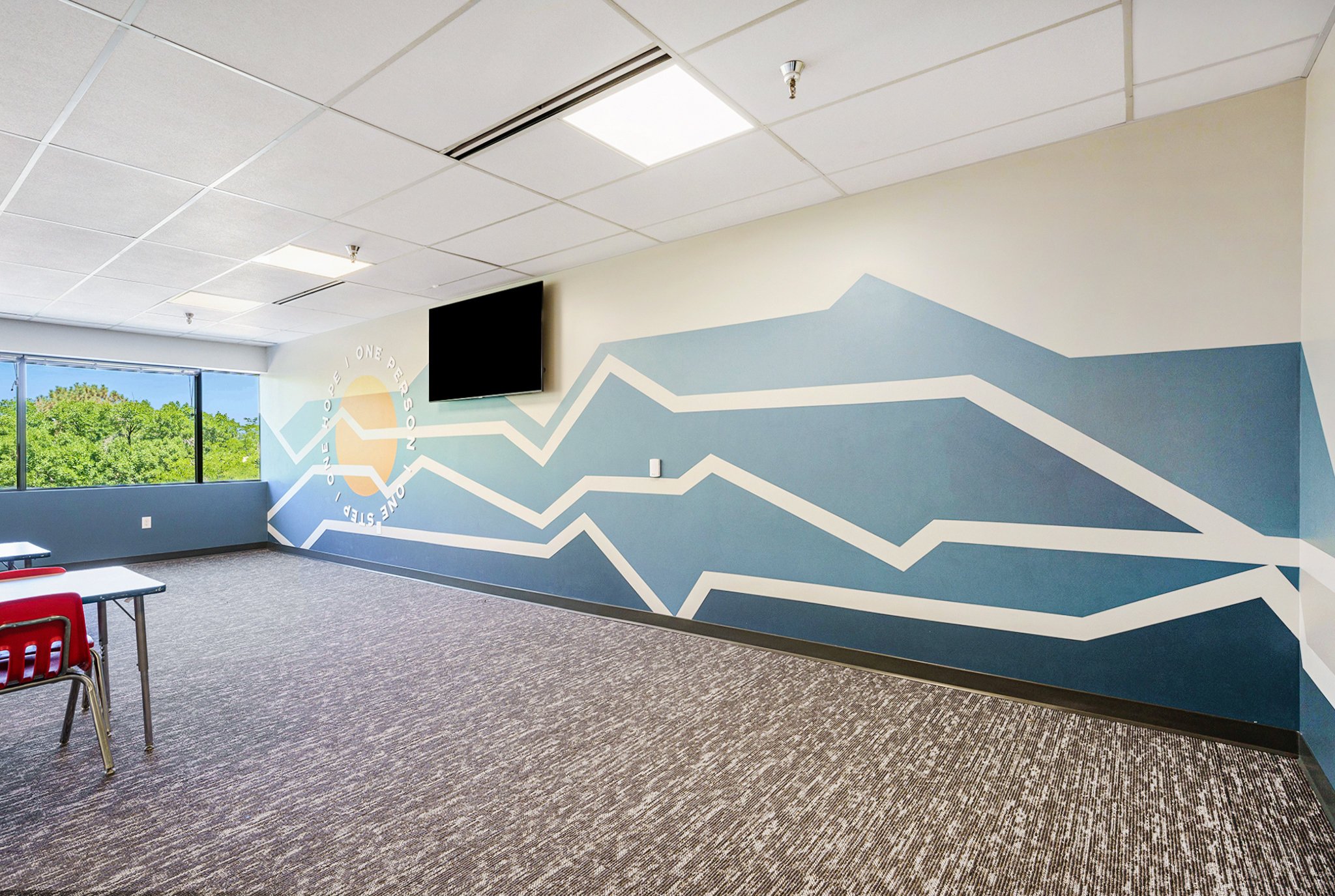
After focusing our efforts on the main level of One Hope Church, we set our sights on the kids space. The client was interested in an outdoorsy visual theme but primarily wanted the space to feel warm, welcoming and cohesive. To start, we created the One Hope Kids logo and color palette to compliment the greater church brand - with a kid-friendly flare. The organic, cut-paper illustration style throughout adds a dynamic quality to the outdoor imagery without feeling either cartoonish, or flat and boring. We added some simple slat wood wall treatments for a touch of natural texture and warmth. And finally, dimensional text and room signage provides a high-impact wayfinding and encouraging messages for kids and parents to look for when they come each Sunday.


In order to maintain brand recognition and visual consistency, we incorporated the new One Hope Church logo icon instead of creating a separate, unique mark.
Inspired by cut paper collage, the shapes and letterforms have an imperfect, organic quality to them without losing the effectiveness of the original OHC icon silhouette.


The kids space included a lobby/check-in area, a short hallway and three classrooms. Building off of the One Hope Kids logo, we created Colorado-inspired scenes and patterns in the same cut paper illustration style.
The painted patterns and scenery were brought to life by a talented local muralist team - Lupine Design Co.
High-impact room signs, dimensional text and shapes, as well as some simple slat wood treatments helped the space feel fun and engaging for families.


